Reactiv
Last updated: September 3, 2026
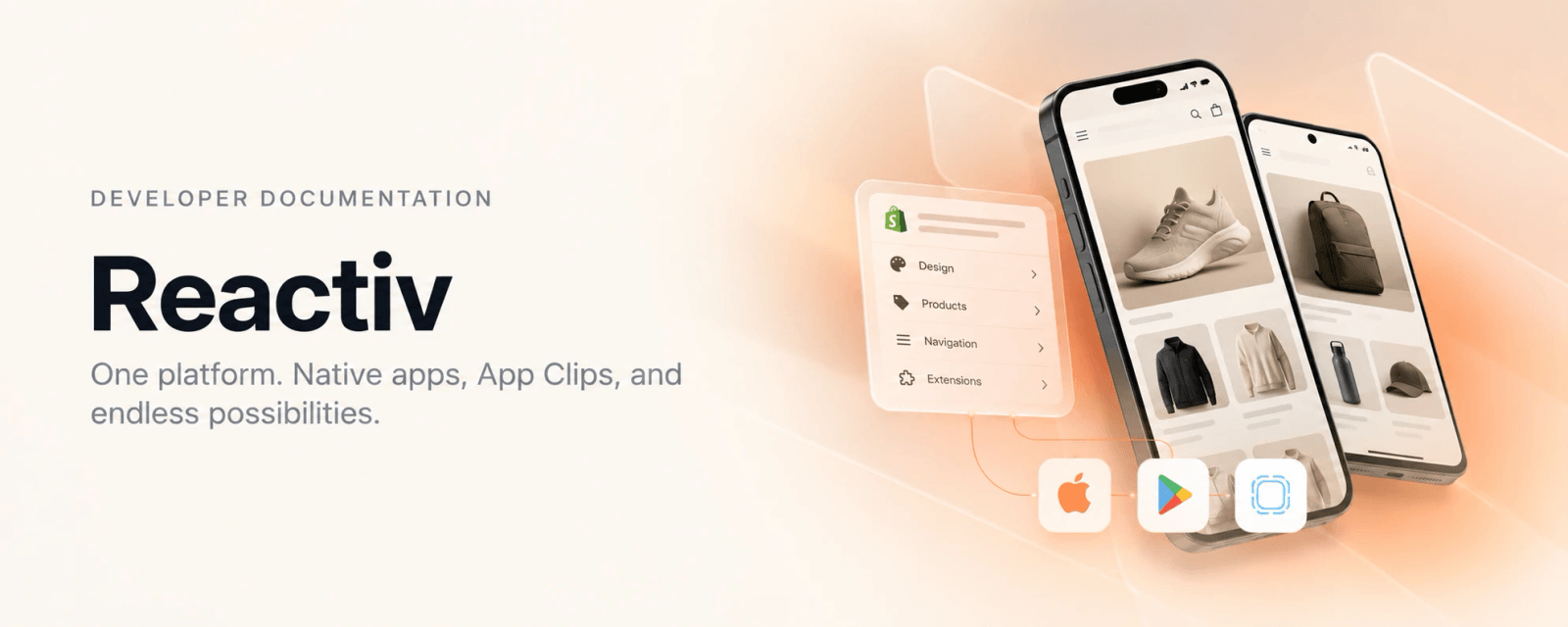
Reactiv turns a Shopify storefront into native iOS and Android apps and instant-launch App Clips. Merchants build and publish their app from a no-code Dashboard. Engineering teams that need more than the Dashboard offers extend the app in code through the Plus Framework, without forking or modifying the core.
This page explains how the pieces fit together. The first half is for anyone evaluating or working with Reactiv. The second half is for engineers who will build on it.
The platform at a glance
Three ideas explain almost everything else on this page:
- Reactiv ships one central codebase, and customization is additive. The Reactiv team maintains the core, including security, platform updates, and ongoing maintenance, so every merchant benefits from the same foundation. Merchants who need more use the Plus Framework to inject an isolated custom library that registers new components and modifies what the Dashboard produced as the app renders. The core is never forked or modified per merchant.
- The Dashboard is the source of truth for what the app shows. Screens, sections, menus, branding, integrations, and settings are authored there and published as a configuration document. The app is, from the platform's point of view, a renderer of that document.
- App Clips share the same configuration. The Swift App Clip reads the same published config, so a merchant's instant experience and full app stay consistent.
Part 1: Platform concepts
The Reactiv Dashboard
The Dashboard is a Shopify-embedded web app where a merchant builds their mobile app the way they build their web storefront. It has three surfaces that matter for understanding the platform:
| Surface | What it controls |
|---|---|
| App Studio | Which screens exist, which sections appear on each screen and in what order, menu and tab structure, branding, copy. The Publish button emits a new configuration document. |
| Build Settings | App identifiers, store listing details, and signing credentials. The build pipeline only builds apps that are configured here. |
| Workflows and Releases | Build history, artifacts, and release status. |
Integrations are also enabled and configured in the Dashboard. Reactiv connects natively with the platforms a brand already runs on, with no custom middleware. The app reads the integration configuration and initializes the matching service at launch. The integrations catalog is organized into six categories:
| Category | Examples |
|---|---|
| Marketing & Communication | Klaviyo, Braze, OneSignal, Attentive, Iterable, Meta, Google Ads |
| Merchandising & Discovery | Searchspring, Nosto, Rebuy, Constructor, Videowise |
| Orders & Shipping | Recharge, Ordergroove, Skio, Loop Subscriptions, Zapiet, AfterShip, Loop Returns |
| Loyalty & Retention | Yotpo, Okendo, Judge.me, Stamped.io, Smile.io, LoyaltyLion, Swym |
| Data & Infrastructure | Google Analytics, Firebase, Mixpanel, Segment, AppsFlyer, Snowflake |
| Customer Support | Gorgias, Zendesk, Intercom, Kustomer |
See the full list of integrations for every supported partner.
The configuration document
Publishing from the Dashboard produces a versioned JSON document served from Reactiv's configuration service. The data model is small and regular:
| Entity | Purpose |
|---|---|
application | App-wide settings: brand colors, typography, feature toggles, behavior flags |
screens | Every screen in the app, each referencing an ordered list of sections |
sections | Reusable UI blocks placed on screens, each with a template, an outlet, and a settings map |
blocks | Sub-elements inside sections (for example, slides in a carousel) |
menus | Tab bar and navigation structure |
integrations | Enabled third-party services and their settings |
tokens | Design system token values derived from the merchant's brand settings, applied to every component |
Every entity is keyed by a stable UUID and validated against a schema when the app loads it. The schema and typed accessors ship as a versioned library, @reactivapp/config, that the app and any custom code consume. When the Dashboard gains a new capability, the config library gains the matching template and schema, and the app learns to render it. This contract is what lets the Dashboard, the app, and the App Clip evolve independently.
Design tokens
The configuration document also carries the merchant's brand, and the app expresses that brand through design tokens. Brand settings live in the application entity and are set in the Dashboard: primary and secondary colors, corner radius, typography, button label colors, and logo, icon, and splash assets. The tokens entity holds the design system token values derived from those settings. At launch the app applies them, so every component built on the Reactiv Design System picks up the merchant's brand without any per-component styling.
| Brand setting in config | Token tier it feeds | Effect |
|---|---|---|
| Primary color | Semantic | Brand accents, primary actions, highlights |
| Secondary color | Semantic | Supporting surfaces and secondary emphasis |
| Corner radius | Semantic | Buttons, cards, inputs, and badges follow the same radius |
| Typography | Semantic | Font family applied across headings, labels, and body text |
| Button label colors | Component | Label contrast on primary and secondary buttons |
Because the tokens are derived from configuration, a brand change in the Dashboard restyles the whole app on the next launch with no code and no app store release. Merchants who need finer control than the Dashboard exposes can override individual tokens in code; see Theming and design tokens.
Screens, sections, templates, and outlets
Four terms recur throughout Reactiv:
- A screen is a routable page: Home, a collection, a product, the cart, the account area.
- A section is a block of UI placed on a screen. A hero carousel, a product grid, a promotional banner, a reviews summary.
- A template identifies what kind of section or screen something is. The Dashboard places sections by template. The app knows how to render each template.
- An outlet is where on a screen a section renders. The standard outlets are
HEADING,BODY,FOOTER, andPRODUCT_LIST.
A published screen is therefore a list of (template, outlet, weight, settings) tuples. The app sorts by weight within each outlet and renders each template with its settings. Nothing about a merchant's layout is hardcoded in the app.
What ships in the core
The core app is a complete commerce experience that every merchant gets without writing code:
- Catalog and discovery: home, collections, product listing with filtering and sorting, search, product detail pages with variants, media, reviews, and recommendations.
- Commerce: cart, discounts, subscriptions, bundles, and checkout. Payments never touch Reactiv code. Checkout is handled by Shopify's Checkout Sheet Kit, so the merchant's existing payment setup, fraud tooling, and post-purchase flows apply unchanged.
- Customer: accounts, order history, wishlists, save-for-later, loyalty programs, digital downloads, store locator, pickup and delivery options.
- Engagement: push notifications with the merchant's chosen provider, abandoned-cart messaging, live chat, back-in-stock alerts, Apple Wallet and Google Wallet loyalty passes, deep linking and attribution.
- Foundations: light and dark mode, localization, accessibility support, offline handling, analytics events, and crash reporting.
Each of these is a set of templates the Dashboard can place, backed by a component in the app that reads its settings from config.
App Clips
An App Clip is a lightweight slice of an iOS app that launches instantly from a QR code, NFC tag, link, or ad, with no App Store download. Reactiv ships App Clips through ReactivClipKit, a precompiled Swift framework that provides a full config-driven storefront: product and collection pages, cart, checkout, analytics, push, and multi-store support.
The App Clip reads the same configuration document as the full app, so branding and content stay in sync. An invocation URL tells the clip what to show (a product, a collection, a landing page, or home). Merchants who need custom App Clip behavior extend it through a Swift composition system that mirrors the React Native one. Integration details are in ClipKit below; the ReactivClipKit page describes the framework in depth.
Preview, publish, and release
The flow from a change in the Dashboard to a shopper's phone has two independent tracks.
Content and layout changes do not require a new app build. A merchant edits in App Studio, previews the unpublished config on a device through a preview link, and presses Publish. Installed apps fetch the new configuration on next launch.
Native changes go through the build pipeline. When Build Settings change, a new platform release ships, or a build is requested, the pipeline produces signed iOS and Android binaries from the shared codebase configured for that merchant and uploads them to App Store Connect and Google Play.
Most of what a merchant changes day to day is content and layout. Because that flows through configuration rather than code, changes reach shoppers in minutes and never wait on an app review.
Beyond no-code: the Plus Framework
Some merchants need experiences the Dashboard cannot express: a proprietary calculator, a custom loyalty tier display, a bespoke product card, a tab that opens content from a third-party CMS. The Plus Framework is the code-side extension mechanism for those cases.
The principle is simple. Everything the Dashboard produces is already a set of registered components arranged into a layout. The Plus Framework exposes that same machinery to merchant code, so a merchant's engineering team can:
- Register new screens and sections and place them anywhere in the app
- Modify what the Dashboard produced: reorder, hide, relabel, or inject content into typed slots on core screens
- Replace or restyle tabs, intercept deep links, and override design tokens
All of this lives in a custom library dedicated to that merchant. The library is injected into the Reactiv app during the build process and powers the customizations in that merchant's app.
Part 2: For developers
This section assumes familiarity with React Native and TypeScript. It describes the Plus Framework in enough depth to understand how a customization is built.
The extension model
Three cooperating pieces make the app customizable. Together they are the Core Framework, and the Plus Framework is the workflow of building on them.
Registry. A map from template identifier to a render callback, filled once at startup before the React tree mounts. Four things register: screens, sections, menu items, and link handlers. The core registers the shared components every merchant gets, then exactly one merchant library registers its own.
Compositions. The runtime instances. Seeded from the published configuration, then created and modified by code. A composition carries its template, its props, its weight for ordering, and for sections its screen and outlet. Compositions live in React state and are consumed through the useCompositions() hook.
Outlets. Hooks that connect the two at render time. A screen outlet walks the screen compositions for a navigator and emits the route for each registered template. A section outlet does the same for sections within a screen. Both spread the composition's props into the registered render callback. A registered component therefore receives its composition props as ordinary React props.
A merchant custom library
Each merchant's code lives in one library, generated by a scaffold command and wired into the app automatically. It exports two things:
export { registerCustomComponents } from './customizations/registerCustomComponents';
export { CustomCompositions } from './customizations/CustomCompositions';
registerCustomComponents(registry)runs once at startup, outside React. It registers screens, sections, link handlers, and startup initializers.CustomCompositionsis a React component that renders nothing. It runs inside the compositions provider and is where you create and modify compositions withuseCompositions().
The library is included in the merchant's app at build time, so its registrations and compositions are present from the first launch.
Registering components
Registration is declarative. You give the registry a template identifier and a render callback.
import { Registry } from '@reactiv-mobile-core-framework';

import { PromoBanner, PromoBannerProps } from '../components/PromoBanner';
import { SizeGuideScreen } from '../screens/SizeGuideScreen';

export const ACME_PROMO_BANNER = 'acme-promo-banner';
export const ACME_SIZE_GUIDE_SCREEN = 'acme-size-guide-screen';

export const registerCustomComponents = (registry: Registry) => {
  registry.registerSection(ACME_PROMO_BANNER, (props: PromoBannerProps) => (
    <PromoBanner {...props} />
  ));

  registry.registerScreen(
    {
      defaultScreenName: 'SizeGuideScreen',
      templateUuid: ACME_SIZE_GUIDE_SCREEN,
      navigator: 'CustomScreensNavigator',
    },
    () => <SizeGuideScreen />,
  );
};
The type annotation on the section's props is the contract. Whatever a composition puts in props arrives here, typed.
Creating and modifying compositions
CustomCompositions uses useCompositions() to shape the layout. The three families of methods are create*Composition, modify*Composition, and query helpers.
Place a new section on the home screen:
import { useCompositions } from '@reactiv-mobile-core-framework';
import { ConfigOutlet } from '@reactivapp/config';

import { PromoBannerProps } from '../components/PromoBanner';
import { ACME_PROMO_BANNER } from './registerCustomComponents';

const HOME_SCREEN_UUID = '<home screen uuid from the Dashboard>';

export const CustomCompositions = () => {
  const { createSectionComposition } = useCompositions();

  createSectionComposition<PromoBannerProps>({
    screenUuid: HOME_SCREEN_UUID,
    templateUuid: ACME_PROMO_BANNER,
    uuid: 'acme-promo-banner-home',
    props: { title: 'Free shipping this week' },
    outlet: ConfigOutlet.BODY,
    weight: 5,
  });

  return null;
};
Rename and move a tab, using the framework's enum for core menu identifiers:
import {
  CoreMenuTemplateUuid,
  useCompositions,
} from '@reactiv-mobile-core-framework';

const { menuCompositions, modifyMenuComposition } = useCompositions();

const wishlistTab = menuCompositions.find(
  (item) => item.templateUuid === CoreMenuTemplateUuid.Wishlist,
);
if (wishlistTab) {
  modifyMenuComposition(wishlistTab, { label: 'Saved', weight: 3 });
}
Filling typed slots on core screens
Core screens and sections expose composition slots: optional, typed props a merchant can fill. This is how a merchant injects content into a shared screen without the platform knowing anything about that merchant. Slots are declared in the framework's public types and identified by CorePlatformTemplateUuid.
import {
  CorePlatformTemplateUuid,
  FiltersScreenCompositionProps,
  RenderFilterSectionHeader,
  useCompositions,
} from '@reactiv-mobile-core-framework';

import { AcmeFilterHeader } from '../components/AcmeFilterHeader';

const renderFilterSectionHeader: RenderFilterSectionHeader = (options) => (
  <AcmeFilterHeader {...options} />
);

export const CustomCompositions = () => {
  const { screenCompositions, modifyScreenComposition } = useCompositions();

  screenCompositions
    .filter(
      (screen) =>
        screen.templateUuid === CorePlatformTemplateUuid.FiltersScreen,
    )
    .forEach((screen) => {
      modifyScreenComposition<FiltersScreenCompositionProps>(screen, {
        props: { renderFilterSectionHeader },
      });
    });

  return null;
};
Two details matter here:
renderFilterSectionHeaderis defined at module scope, so its identity is stable across renders. Functions passed inpropsare compared by reference, and a stable identity keeps re-renders cheap.- The payload contains only the keys being changed. Existing props are preserved, so there is no need to spread them back in.
The core exposes typed slots across the product detail page, cart, account, search, filters, reviews, wishlist, order history, onboarding, and more. When a merchant needs a slot that does not exist yet, the platform adds one: a typed optional prop and a one-line delegation in the shared component. The merchant then fills it. The shared component never contains merchant logic.
Menus, tabs, and startup initializers
Tab bar changes can be made at runtime as above, or applied before the first render with a composition initializer. Initializers are pure functions registered from registerCustomComponents that transform the initial composition state synchronously, so a replaced or hidden tab never flashes its default first.
import {
  CoreMenuTemplateUuid,
  registerCompositionInitializer,
} from '@reactiv-mobile-core-framework';

export const registerCompositionInitializers = () => {
  registerCompositionInitializer((state) => ({
    ...state,
    menuCompositions: state.menuCompositions.map((item) =>
      item.templateUuid === CoreMenuTemplateUuid.Wishlist
        ? { ...item, hide: true }
        : item,
    ),
  }));
};
| Menu property | Effect | Route still reachable? |
|---|---|---|
hide: true | Removes the tab from the navigator entirely | No |
hideFromTabBar: true | Hides only the tab button | Yes, from deep links and buttons |
Use an initializer when the data is available synchronously (hardcoded, cached, or a feature flag). Use runtime useCompositions() when the change depends on React context, navigation, authentication, a network response, or user interaction.
Link handlers
Merchant code can intercept deep links before the default navigation runs. A handler receives the link and navigation helpers, and returns whether it handled the link. Handlers run in registration order, and returning {handled: false} passes the link along.
import { DeepLinkActionType } from '@reactiv-mobile-core';
import { Registry } from '@reactiv-mobile-core-framework';

registry.registerLinkHandler(DeepLinkActionType.page, (link, navigate) => {
  if (link.value === 'size-guide') {
    navigate('CustomScreensNavigator', { screen: 'SizeGuideScreen' });
    return { handled: true };
  }
  return { handled: false };
});
Theming and design tokens
Reactiv's UI is built on the Reactiv Design System, distributed as the packages @reactivapp/ui-core (tokens and schemas) and @reactivapp/ui-native (React Native components and layout primitives). Every component is styled entirely from design tokens organized in three tiers:
| Tier | Example | Purpose |
|---|---|---|
| Primitives | primitives.color.neutral.100 | Raw palette and scale values |
| Semantic | color-scheme.bg, semantic.spacing.3 | Meaning, not appearance |
| Component | component.button.border-radius | One token per styled part of each component |
Two layers of theming apply at runtime:
- Brand settings from the Dashboard (primary color, corner radius, typography) flow into the semantic tier. This is what most merchants use, and it requires no code.
- Merchant token overrides let a Plus developer restyle components beyond what the Dashboard exposes. Overrides are authored as sparse DTCG JSON in the custom library, compiled into a typed override map by a build step, and applied by the design system provider. Override a semantic token and every component that aliases it follows. Override a component token and only that part changes. Dark mode values are opt-in per token.
Because components read tokens rather than hardcoded values, restyling never requires touching component code or patching colors at individual call sites.
Quality and verification
Custom libraries carry their own lint and test targets. The platform's CI gates run type checking, lint with zero warnings, and the full test suite for every affected project. Tests use React Native Testing Library with real providers and mock only at the SDK boundary, so they exercise the integration between components and state rather than asserting on mocked context values.
ClipKit
Reactiv Clip is included with some Reactiv plans. It is configured the same way the full app is, through the Reactiv Dashboard, and when enabled it is bundled automatically with your iOS app. No additional development is needed.
For teams that want to embed the Clip experience into an iOS app they build themselves, Reactiv offers ReactivClipKit: a precompiled Swift framework distributed as a Swift package from reactivapp/ReactivClipKit-SPM. An iOS team adds the package, initializes it with the merchant's Reactiv identifiers, and renders a single view. Everything the clip shows still comes from the merchant's published configuration.
.package(url: "https://github.com/reactivapp/ReactivClipKit-SPM.git", from: "2.0.0")
A minimal App Clip target does three things:
try ReactivClipInitialize(
    appIdentifier: "<reactiv-app-id>",
    reactivEventsToken: "<events-token>",
    appStoreID: "<app-store-id>",
    parentBundleIdentifier: "com.example.app"
)

ReactivClipView()
ClipKit supports two integration modes:
| Mode | What it does | Guide |
|---|---|---|
| Standalone App Clip | The classic instant experience launched from a QR code, NFC tag, link, or ad. Single-store and multi-store initialization; multi-store picks the store whose URL is the longest prefix of the invocation URL. | Usage |
| Full App embedding (2.3+) | Drop ClipKit into an existing iOS SwiftUI app. Reactiv URLs and push notifications present the commerce experience as a full-screen cover over the host app, and dismissing returns the shopper to where they were. | Full App Integration |
Push notifications require the host to register for remote notifications and forward the device token and notification taps to ClipKit; the guides above include a complete AppDelegate example. ClipKit requires iOS 16 or later. How the framework works, how it is distributed, and how it is versioned are covered on the ReactivClipKit page.
Further reading in the package repository:
- API reference for initialization functions, event types, error types, and the multi-store API
- FAQ for troubleshooting and common questions
Talk to our team
See Reactiv on your own catalog.
Book a demo and we'll give you a walkthrough scoped to exactly how you sell, from no-download App Clips to homescreen-worthy full apps. Evaluating the Plus Framework? Bring your engineering team and we'll go deep on the extension model and what a first customization looks like.
Book a demo
Glossary
| Term | Meaning |
|---|---|
| Reactiv Dashboard | Shopify-embedded web app where merchants build and publish their mobile app without code |
| App Studio | The Dashboard surface for arranging screens, sections, menus, and branding |
| Configuration document | The published JSON the app and App Clip render, validated against @reactivapp/config |
| Template | Identifier for a kind of screen or section; the Dashboard places by template, the app renders by template |
| Outlet | A named region of a screen where sections render: HEADING, BODY, FOOTER, PRODUCT_LIST |
| Core | The shared React Native application and platform libraries every merchant runs |
| Core Framework | The Registry, Compositions, and outlet machinery that makes the core customizable |
| Plus Framework | The workflow of extending the core through a merchant custom library |
| Custom library | A per-merchant package containing that merchant's screens, sections, compositions, and theme overrides |
| Registry | Startup-time map from template identifier to render callback |
| Composition | A runtime instance of a registered screen, section, or menu item with props and ordering |
| Composition slot | A typed optional prop on a core screen or section that a merchant can fill |
| Composition initializer | A pure function that transforms initial composition state before the first render |
| Reactiv Design System | The token-driven component library, shipped as @reactivapp/ui-core and @reactivapp/ui-native |
| Token override | A merchant-specific design token value that restyles design system components |
| ReactivClipKit | The precompiled Swift framework that powers Reactiv App Clips, distributed via Swift Package Manager |
| Build pipeline | The system that builds and publishes each merchant's signed iOS and Android apps |
Frequently asked questions
Does a layout change require an app store release?
No. Layout, content, branding, and integration settings flow through the configuration document and reach installed apps on next launch. Only native changes require a new build.
How does checkout work?
Checkout is delegated to Shopify's Checkout Sheet Kit. Payment details never pass through Reactiv, and the merchant's existing payment providers, discounts, and post-purchase apps apply unchanged.
How does authentication work?
Shopper sign-in is handled by Shopify. A merchant can use either Shopify's new Customer Accounts or legacy customer accounts, and Customer Accounts is the default. Shoppers sign in securely through a Shopify-hosted web view, and the app stores and refreshes the resulting customer access token. This works seamlessly with Sign in with Shop as well.
What does a Plus developer need to know?
React Native, TypeScript, and the concepts on this page. The Registry, Compositions, and outlet model is small, and a first customization is typically a handful of files.
Apple, App Clips, App Store, Swift, SwiftUI, and Apple Wallet are trademarks of Apple Inc., registered in the U.S. and other countries and regions. iOS is a trademark or registered trademark of Cisco in the U.S. and other countries and is used under license.
Android, Google Play, and Google Wallet are trademarks of Google LLC. Shopify and Shop are trademarks of Shopify Inc. React Native is a trademark of Meta Platforms, Inc. All other trademarks are the property of their respective owners.